


Newsletter Signup - Under Article / In Page
"*" indicates required fields
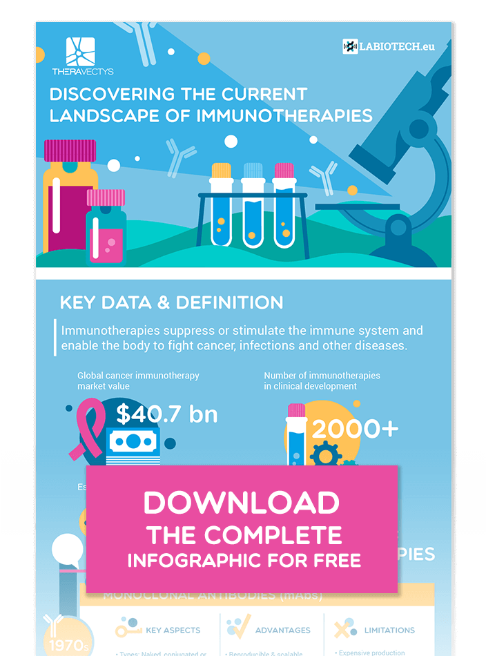
Infographics enjoyed a hay day in the early 2010s. They were a fresh idea and a welcome change to the standard blog post format which the internet was already flooded with.
They worked so well in catching the consumers’ attention, that their decline came as quickly as their rise. As with any new medium, the hype led to hasty work and sloppy infographics. The market adjusted, people became more discerning, and results seemed to slow.
Some marketers said infographics were dead. They were wrong.
The truth is, good infographics are shared 3 times more than articles. They can save readers a lot of time by summarizing complex information in an easy-to-absorb way. Information retention is much easier when it is paired with relevant imagery.
The keyword here is “relevant”. Irrelevant images, even if they’re pretty, will be largely ignored and perceived as annoying, whereas relevant images are scrutinized.
Follow the seven steps below and your next life science infographic should be hungrily consumed and greatly appreciated by your target audience.
First, though, we need to understand how the infographic format fits into a life science marketing campaign, specifically.
How Infographics Work for a Scientific Audience
Why do abstracts exist for peer-reviewed papers?
People have limited time.
A good infographic alleviates the pain of “so much to learn, so little time” for its target audience. Who has more to learn than a scientist, medical professional, or CEO of a life science company?
If your target audience are research scientists, you might use this format to summarize a pile of peer-reviewed research (the “meta-study infographic”). Your readers could then scroll down to the list of citations at the bottom and, suddenly, hours of time are saved!
You could help physicians by comparing the litany of available drugs or equipment on the market for a particular indication. You could support the director of a biotech startup by analyzing the current state of competition in their space.
Once you identify what your target audience is concerned about and what takes up most of their time, you have endless options for effective infographics. The next question is how do you make it as good as it can be and give it the best possible chance of going viral?
1. Choose a Topic People Are Hungry For
Your topic is a primary factor in every piece of content you produce. It’s been mentioned time and again, yet too many still try to get away with spending a minimal amount of effort on this step.
First, think over any questions or serious concerns your customers or even colleagues have brought to you. People tell you what they want from you in terms of content indirectly through their queries.
Look at your older content. What’s done particularly well? Whether it’s an article or an interview, it can probably be repurposed into an infographic. If you’ve published something in the past that struck a cord, keep striking it! You can expand on the same topic or build on a parallel one.
Find trending topics across the internet by searching on Google Trends, LinkedIn, Twitter, or by paying attention to what people are saying in online forums in your industry. Again, people are telling you what they want and like through their questions and concerns.
2. Keep Your Text as Succinct as Possible
Your infographic “manuscript”, the text you write before the design, has to be tight. Make it shorter than you think right.
I once wrote for Contellio, a content production company, and I wrote a lot of infographic manuscripts. It took genuine effort in the beginning, to cut down the text enough for it to be easy for the designers to work with.
I learned to look at every line and every word and ask myself: “Does this bring true added value to the reader?”
Put it another way, “Would the value remain if I removed it?” or “Can I replace this word with a shorter one or get the meaning of the sentence across with fewer words?”
3. Make the Design Clear Above All Else
The design follows similar principles to the text. Simpler is better.
Busy infographics are eye-sores. They negate the entire point of the format – to be easily and quickly consumed and understood.
As rules of thumb:
- Use plenty of negative space
- Keep a healthy, consistent margin around the edge and between individual elements
- Make it 800-1000 pixels wide (any wider and they become difficult to read without zooming in and scrolling left and right) and if you want to add more information, extend it downwards
- No more than two fonts
- Prioritize readability and use simple colors with contrast so the text is easy to read
Find ideas at infographic repositories like Nerdgraph, Visual.ly, or Slideshare. Categories of design fall into a few camps:
- Statistical or otherwise data-heavy
- Instructional
- Timeline
- Comparison
- Summaries of complex issues or questions
4. Conduct Solid Research
The main purpose of an infographic is to do the legwork your readers wish they had the time to, and to make your conclusions easy to understand and recall.
You’re saving your audience time and helping them get smarter. That’s the feeling you want them to have when they’re finished.
To encourage the “I just got smarter” feeling, there needs to be trust in your research and interpretations. The best way to earn that trust with a new reader is to have done good research in the first place, drawing from reputable sources. Then, prove it to them by citing every source at the bottom.
An additional hit of trust could come from a little social proof, such as including a quote or two from known industry leaders that back up what you’re saying.
Find external sources through the usual platforms like Google Scholar and Pubmed for peer-reviewed work. For broader statistics, use this handy list of 33 free data sources Forbes put together.
Remember that for many people, your infographic will be their first impression of you, and they will be scrupulous. Don’t cut any corners when it comes to your sources and you’ll have laid the foundation for future brand-loyalty.
5. Build a Narrative with the Data
Without a cohesive narrative, your infographic can be confusing even with a good design. Disconnected data points will have readers skipping back and forth, asking “But what’s the point?”
To construct a narrative with data points, first imagine you are the reader before seeing the infographic, i.e. your target audience or “customer avatar”. How much do they know about the subject already? Now you have your starting point.
Next, imagine you’ve read the infographic and it has achieved what you wanted. Now you have your destination.
The narrative is the path from the starting point to the destination. Lead the reader from point to point, with each building on the last. Start with what they’re most familiar with, and then lead them further into the unknown with each step until you reach the treasure of proper understanding.
6. Promote the Smart Way
One of the best things about infographics is their shareability and the fact that they can get you onto platforms you wouldn’t otherwise be on. Primarily, Slideshare.
Slideshare is an interesting platform. From the start, it was a place for professionals. It’s current 80 million users may log in during their lunch break, looking for presentations about productivity, while at home they’ll use other platforms for non-work-related content. Slideshare’s seamless integration with LinkedIn, the world’s biggest work-focused platform, makes it even more ideal for building a good presence as a life science organization.
Infographics can be posted almost anywhere else too, from Twitter to Pinterest. Submit it to as many infographic directories as you have time for. Start with Nerdgraph and Visual.ly (mentioned earlier) as well as Graphs.net, Infographics Showcase, Infographics Archive, The Infographic Subreddit, to name some of the more popular.
Wherever possible, include a link to the page on your site where you’ve hosted the infographic. Treat this as a landing page.
On the page, include share buttons and perhaps a few tweetable quotes to make it as easy as possible for visitors to share it via their own networks. Display an HTML embed code so other webmasters can post it on their site.
Beneath all that, add a sign-up button giving visitors access to your whitepaper about either the same topic or another that your target audience is interested in. This way, wherever your infographic goes, it has the potential to add people to your email list.
Finally, do a little outreach. Search for articles about the same or similar topic and reach out to the companies that published them. When offering your infographic, make it all about them, highlighting that you think their audience will appreciate it. All the better if you also offer to write an accompanying guest article.
During all your promotion and outreach activity, aim to add value to anyone you or your content comes into contact with, which leads us smoothly to the final step…
7. Keep Your Intentions Pure
As a content creator (and as a business for that matter), you are here to serve.
You want a positive ROI from your infographic, of course. It is a marketing asset, after all. Paradoxically, the best way to make sure that happens is to leave your self-interest at the door.
From choosing the topic to researching deeply, writing honestly, designing clearly, and promoting respectfully, if the readers are your top priority in everything you do, your infographic will have a genuine chance of going viral within your industry.
Sure, linking back to a well-designed landing page with an email sign-up offer will benefit you greatly, but even that puts the reader first. They will want to start building a closer relationship with your brand if they are impressed by your infographic. The backlink and the sign-up offer are merely invitations to do so.
Speaking of invitations, Labiotech provides a front-to-back infographic marketing service that covers all of the above. If you’re interested, click here and book a call with the team by choosing from one of their available slots.